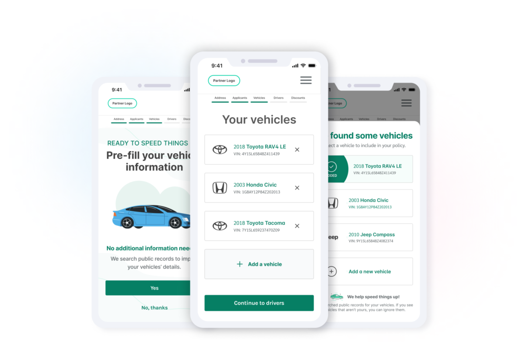
Role
UX/UI Designer
Date
April - June 2023
Scope
White Labeled Insurance Marketplace Landing
Team
1 UX/UI designer, 4 developers,
1 product manager, stakeholders
Empathize
Competitor analysis
Background research
Specify
Feature Prioritization
Functionality requirements
Ideate
Wireframes
Lo-Fidelity Mockups
Bring to Life
Prototype Design
Refinement
Verify
Prototype Testing
User Testing
Our Challenge
We needed to design a feature that would streamline auto insurance quoting for our users
Empathize & Specify: Understanding the need
Why is do we need to streamline the auto quoting flow?
My team’s responsibility and ultimate goal is to get as many users from selecting a line of business to receiving a quote they can speak with our advisors to bind. Streamlining the auto quote flow is vital as it directly supports the team’s goal of guiding users seamlessly from selecting a line of business to binding coverage through advisor interactions. A smooth process enhances the user experience, reduces obstacles, and improves conversion rates, ensuring a more efficient and successful journey for users.
Quoting success rates, where are users abandoning?
When analyzing the quoting funnel metrics, we see a significant drop off of users between the vehicle and drivers page. When we see significant abandonment rates between pages, we need to look into why specifically are users leaving the flow there.
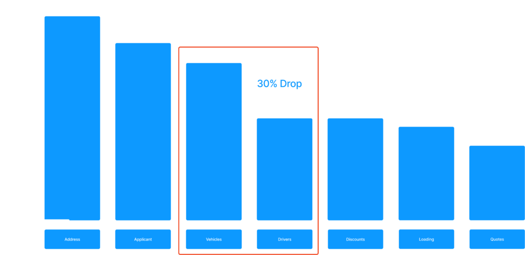
Abandonment Survey
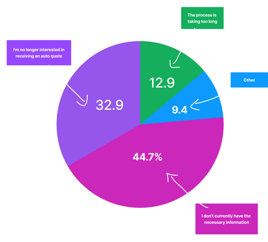
One of the first steps we took to better understand the abandonment rate was to introduce an exit survey on the page. When users hover over the exit tab, we introduce a popup asking why they are leaving with some options we anticipated could be the issue. Over the course of a month, we received 200+ responses.

Abandonment Survey Results
A: I don’t currently have the necessary information – 44.7%
B: I’m no longer interested in receiving an auto quote – 32.9%
C: The process is taking too long – 12.9%
D: Other – 9.4%
Our responses showed a combined total of around 57% of users either did not have the information and did not have the time to input all of their vehicle information. These issues can easiler be solved by introducing a vehicle look-up service!
Ideate & Bring to life: From findings to features
Wireframing to High Fidelity Mockup
With all my research and conclusions in mind, I started building the screens. Starting with some simple wireframes, I drew up some ideas on the whiteboard, sought feedback from my teammates, and then brought the final ideations to life in Figma.
Understanding feature technical requirements
A significant aspect of this project involves understanding the technical requirements of the feature’s lookup service. Ensuring security is important to safeguard user and third-party information. As our service cross-references DMV records with the provided address, it’s crucial to handle instances where vehicles not belonging to the user may appear. We need to take into consideration what details to reveal and what to withhold.

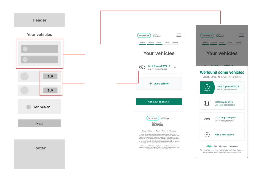
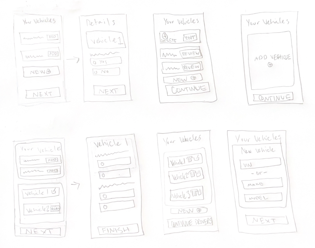
The conversion process of sketches to mockups
I began by sketching out as many possibilities as I could think of, both good ideas and bad. Then once they’re all on paper I sort through them and find at least 3 good concepts then begin converting them into wireframes. Once I had a few wireframes to bring them to the team to discuss possibilities and make comments on how we think they should change when converting to high fidelity.
User Testing
Does this actually work for our users?
Following the creation of the prototypes, we carried out a comprehensive series of unmoderated tests involving over 15 participants. These tests were designed to thoroughly evaluate the usability of our newly developed feature. During our testing, we identified several areas of improvement to create a product our users would find value in.
Reiteration: Change 1
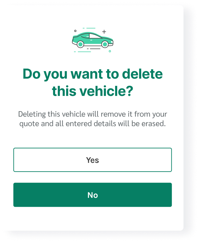
Introduced a confirmation modal when deleting vehicles
During our usability testing, some users accidentally deleted vehicles from their quote by either miss-tapping or not understanding the purpose of the delete button. Our solution was to add a fail-safe confirmation to ensure this is the action users intend to take.
Reiteration: Change 2
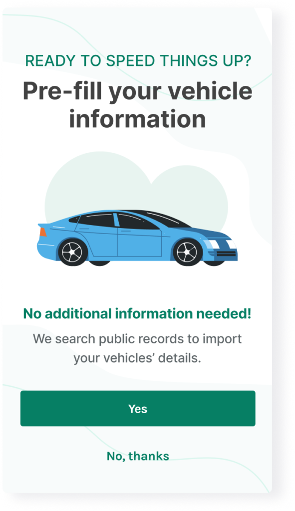
Opt-in messaging
This solution allowed us to kill two birds with one screen! During our testing, some users expressed discomfort that their information automatically generated into our system. They did not understand how or why we were able to know exactly what cars they owned without providing the details. Even when we made messaging that explained how we pull their car registration from state DMV records. Therefore, we added an opt-in screen that allows users to be in control and shows our system fetching the data. This also saved the business over $10k a month on submission request fees!
Verify: Did we solve the problem?
Validating our new feature in the real-world
Ensuring the validation of the feature post-production is crucial for making sure we have achieved the goal set at the beginning of the project. This is also a great opportunity to continue refining the experience so that it provides value. It ensures that the product aligns with user expectations and enhances overall user satisfaction.
A/B Testing
Before we could begin ideating on potential solutions to improve the Covered Whitelabel landing page, we needed to conduct research. The team was able to identify user experience issues immediately, but in order to better understand our users and their pain points, we needed data to back our decisions. We began by pulling Google Analytic insights to see where our biggest drop off point occurs through-out the entire quoting experience.
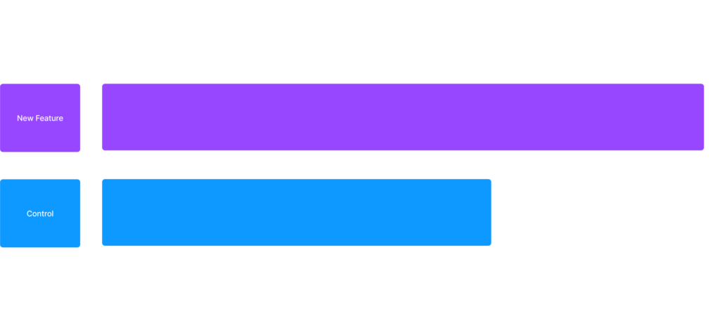
Time to Quotes
Before we could begin ideating on potential solutions to improve the Covered Whitelabel landing page, we needed to conduct research. The team was able to identify user experience issues immediately, but in order to better understand our users and their pain points, we needed data to back our decisions. We began by pulling Google Analytic insights to see where our biggest drop off point occurs through-out the entire quoting experience.
User's completed the application process significantly faster
Final Prototype
Click around and get to know the product
Final thoughts
Making the process of finding insurance easier for our users is a difficult challenge with a meaningful reward
Crafting an auto-fill feature for vehicle information in the context of auto insurance aims to simplify a traditionally intimidating task. The goal is to create a user-friendly platform that not only consolidates the search for the best rates and coverages but also streamlines the entire insurance-shopping process. By making this process quick and easy, the feature adds tangible value to users, reducing complexity and stress associated with insurance decisions. Ultimately, the aim is to empower users and enhance satisfaction by providing a straightforward solution in the larger process of securing the best insurance options.

