Increase user conversions and meet WCAG accessibility guidelines
The goals set by our stakeholders were to increase conversions from the landing page into the quoting experience and to bring our website into ADA compliance standards. Our team set a goal to increase our conversion rates by 35% and to adhere to AA compliance standards.
Empathize & Specify: Understanding the need
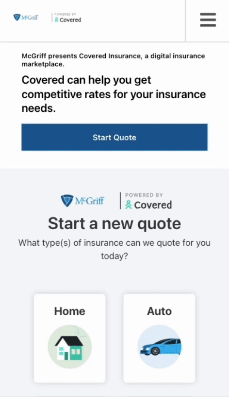
Evaluating the Current State Landing Page
Before we could begin ideating on potential solutions to improve the Covered Whitelabel landing page, we needed to conduct research. The team was able to identify user experience issues immediately, but in order to better understand our users and their pain points, we needed data to back our decisions. We began by pulling Google Analytic insights to see where our biggest drop off point occurs through-out the entire quoting experience.
According to Google Analytics data collected between October 2022 and February 2023
did not proceed past the landing page
0% of users
This metric confirmed that redesigning the landing page was our team’s top priority. The number one goal for our landing page across all white-labeled platforms is to have users enter our quoting funnel for leads to be generated for our agents.
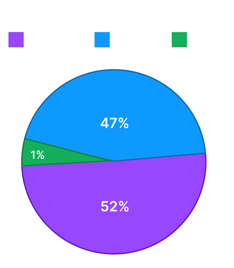
Understanding user traffic
52% of users were on desktop computers
47% of users were on mobile devices
1% of users were on tablet devices
These analytics revealed that we needed to prioritize optimizing the mobile experience. The original landing page was not optimized for mobile screens, meaning 47% of users were encountering an unideal experience.
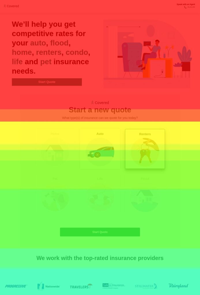
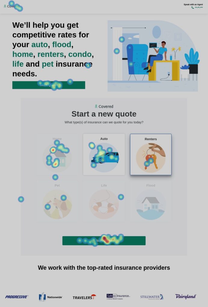
Insights into user interactions with heatmaps
Or next goal was the understand how users currently interacted with our landing page. When we pulled the heatmaps we found that 40% of users do not scroll to the “Start Quote” call to action. We also found that less than 10% of users continued scrolling past the line of business call-to-action buttons. All information below was almost never seen.
Unmoderated user testing
To better understand the pain points our users were experiencing, we conducted a series of unmoderated user testing sessions. In these tests, we asked users to perform a set of tasks and asked questions about the landing page.
Users found the double CTA's confusing (demonstrated in video)
18% of users expressed they would not trust covered with certain personal information
When asked to start a bundled quote, 30% of users stuggled to complete the task
User's became more excited about the platform once they saw carrier logos they recognized
Based on our research, these are some of the key changes we made:
Ideate & Bring to life: From findings to Designs
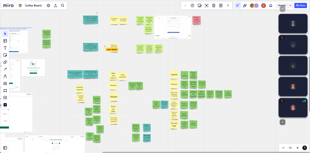
Working within an Agile team environment
As a part of an Agile team, it is important that design and development communicate throughout the entire process. We story map as a team to gain team-wide project understanding and I introduce collateral along the way.
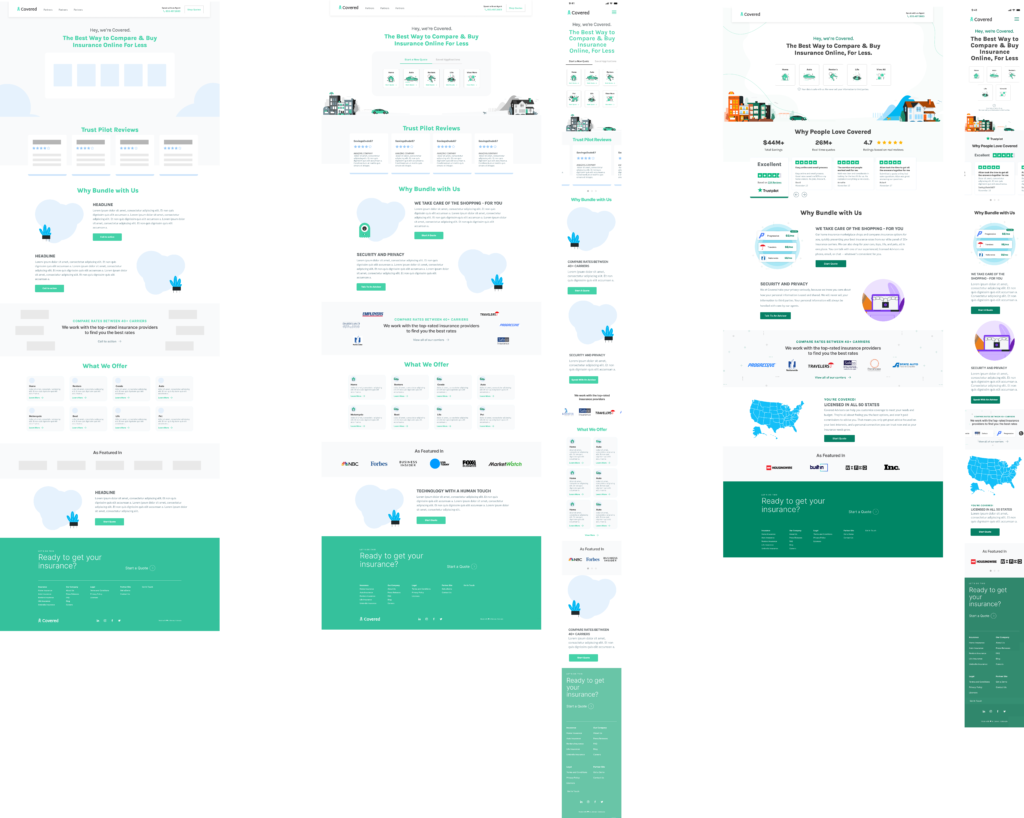
Wireframes to High Fidelity
Refine, refine, refine
A key aspect of Agile development in design is the iterative and collaborative approach to creating and refining solutions. Iterative Prototyping was a focus for me so we could refine and test quickly.
Usability Testing
Does this actually work for our users?
Following the creation of the prototypes, we carried out a comprehensive series of unmoderated tests involving over 15 participants. These tests were designed to thoroughly evaluate the usability of our newly developed feature. During our testing, we identified several areas of improvement to create a product our users would find value in.
Reiteration: Change 1
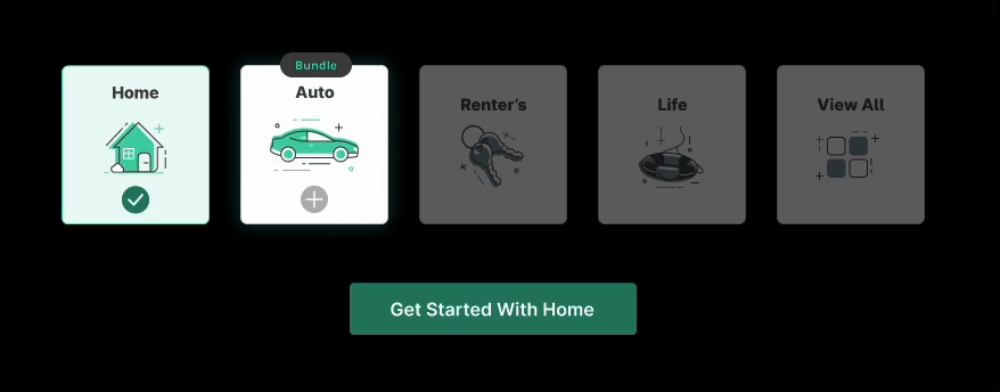
More descriptive dynamic CTA's
During testing, some users expressed that they wanted more certainty about what type of quote they were proceeding with. Previously, we left the CTA as “start quote,” but pivoted to a dynamic button to erase any confusion.
Reiteration: Change 2
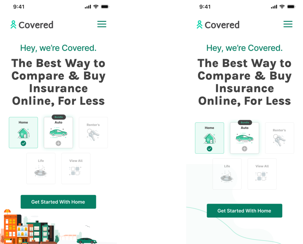
Simplify above the fold for mobile screens
A great piece of feedback we heard from users was that mobile testers commented on how busy the line of business selection was, and we agreed! We removed the illustration from the background on mobile and focused on providing a clean and simple experience.
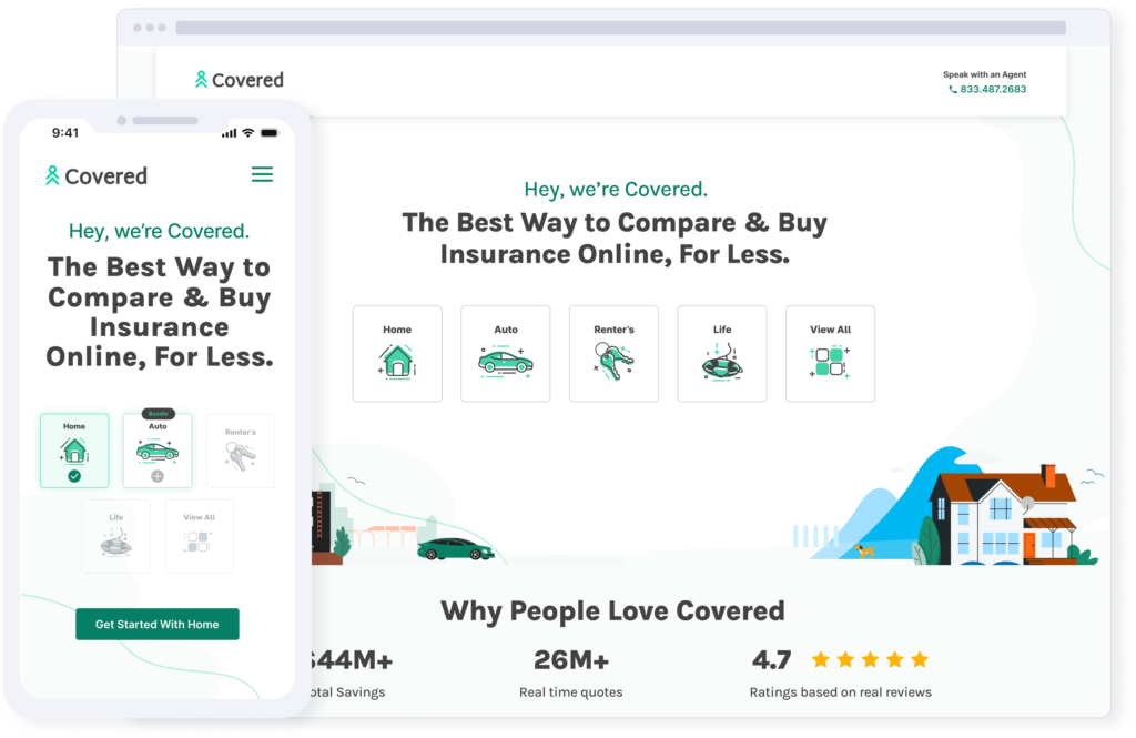
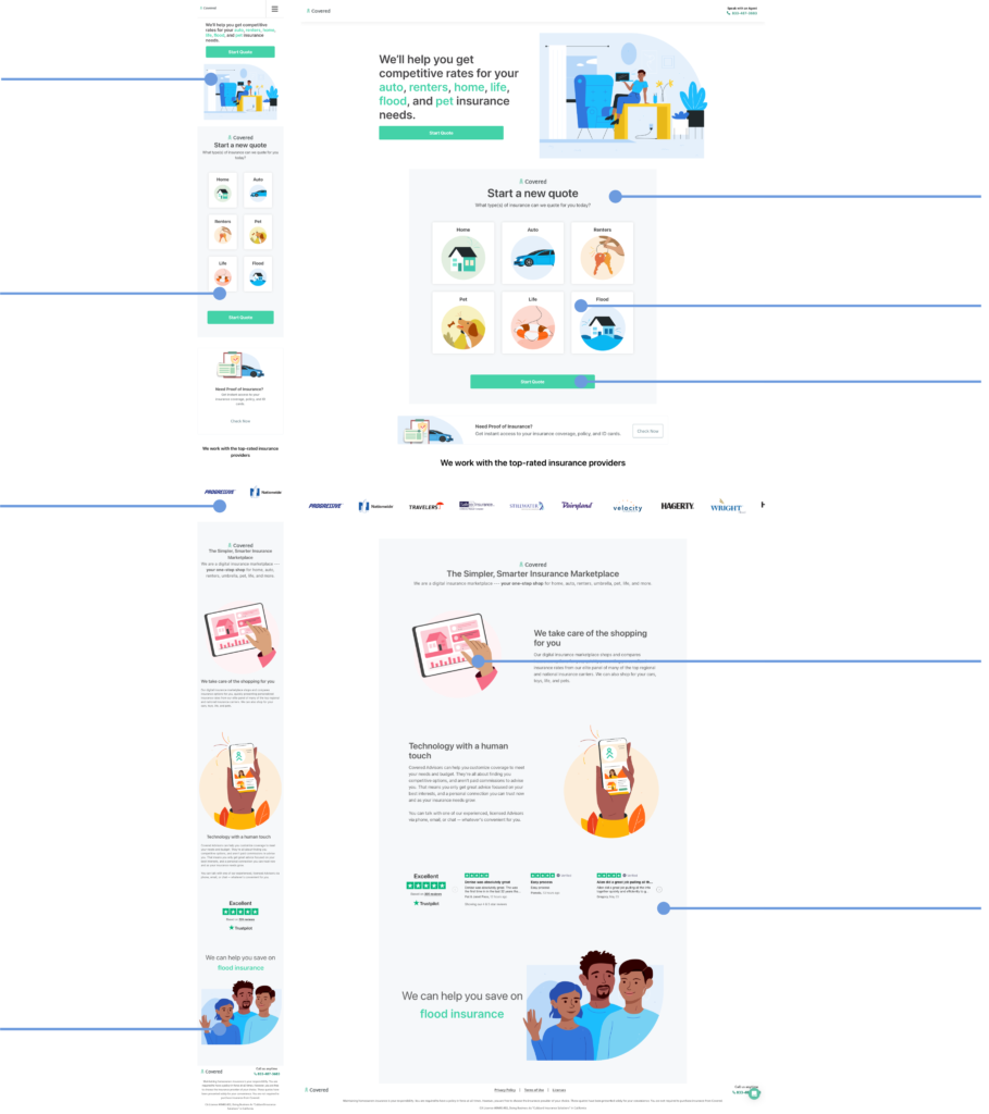
The Final Product
Original
Redesign
SOLUTIONS
What Were SomeKey Moments?
Key Moment
Meeting WCAG Accessibility Standards
Our team’s top priority from stakeholders was to bring the landing page to ADA compliance standards. This was a large undertaking because we had to work with marketing to change our brand’s primary color due to contrast ratio issues. I worked closely with engineering to ensure we were meeting accessibility standards surrounding screen reader text, tabbing, and contrast.
Remove all instances of colors that did not pass WCAG color contrast ratio standards
Created a color matrix with all digital brand colors outlining compliance levels for cross-team designers to reference
Make all clickable elements available through tab navigation
Added ALT text to all images for screen readers
Key moment
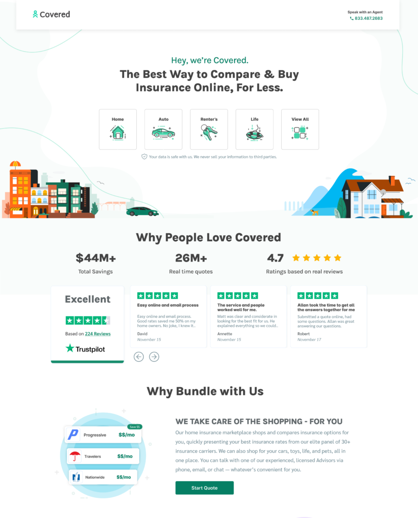
Organic Bundling Messaging and Interaction Design
A major goal for this redesign was to have all line of business selectors above the fold for both desktop and mobile views. This required us to get creative in how we displayed our main messaging and call to action. An objective set by stakeholders was to include clear and compelling bundling messaging as well.
Key moment
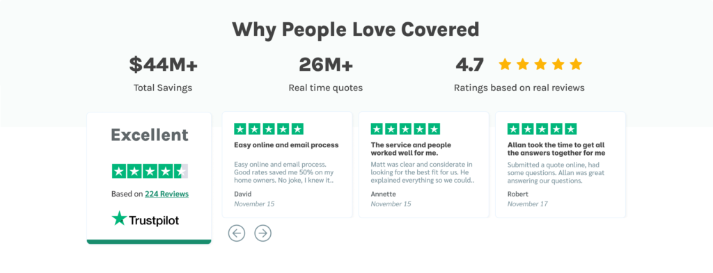
Building User Trust
During user testing, we received feedback that users are hesitant to proceed with quoting because they are unsure of who Covered Insurance is. Inorder the establish that trust, we moved our Trustpilot reviews to the top of the page and added some awesome data points about Covered’s impact on users!
Verify: Did we solve the problem?
Validating our new feature in the real-world
Ensuring the validation of the feature post-production is crucial for making sure we have achieved the goal set at the beginning of the project. This is also a great opportunity to continue refining the experience so that it provides value. It ensures that the product aligns with user expectations and enhances overall user satisfaction.
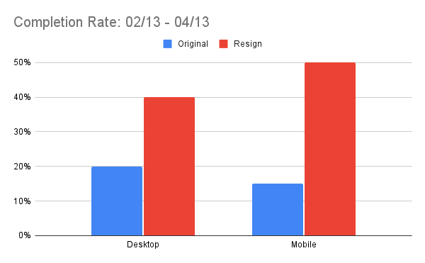
Increased quote funnel entry rates
We defined our completion rate as users who entered a quoting funnel. After A/B testing the redesign with our original design as a control, we saw a 20% increase in Desktop devices and a 35% increase in Mobile devices!
Our end product met ADA standards
Once the redesign was live in production, we had a third party come in to conduct an accessibility audit. We passed the audit with an incredible score of 95%!
Final Prototype
Click around and get to know the product
Final Thoughts
Creating an accessible, user-centric landing page
Ensuring the validation of the feature post-production is crucial for making sure we have achieved the goal set at the beginning of the project. This is also a great opportunity to continue refining the experience so that it provides value. It ensures that the product aligns with user expectations and enhances overall user satisfaction.